

Color is one of the most subjective decisions in brand development. People often have an immediate reaction to a shade—and strong opinions about whether they like it.
But choosing brand colors takes more than personal preference. The question is which colors express your brand’s personality, connect with your audience, and distinguish you from competitors.
Color psychology offers a useful starting point. Common associations can inform your choices, but a color’s meaning also depends on context, culture, shade, and how it’s used.
Below, we explore the associations of 12 popular colors, share a color psychology chart, and offer practical advice for choosing a palette your brand can use consistently.
CONTENTS
- What Is Color Psychology?
- How Color Psychology Impacts Your Brand
- Color Psychology Chart
- The Psychology of 12 Popular Colors
- 5 Tips for Picking Your Brand Colors
- The Takeaway
What is Color Psychology?
Color psychology is the study of how color impacts the way we perceive the world. Colors have a powerful effect on our emotions, and these emotions play a major role in how we behave as consumers.
Color psychology provides a framework for understanding how and why we interact with the brands in our lives. It’s a powerful tool that can be used to design more meaningful—and memorable—brand experiences. Research has shown that color can increase brand recognition by up to 80%.
How Color Psychology Impacts Your Brand

Color psychology is a uniquely valuable tool for shaping the perceptions that drive customer behavior.
Our emotions directly influence our behavior, after all. And color is one of the most reliable ways to evoke specific emotions in the minds and hearts of your target audiences.
Color has a measurable influence on purchasing decisions when it comes to your brand. In fact, studies show that 85% of customers identify color as a primary reason for choosing one brand over another.
With this in mind, color psychology should play a role in everything from the type of logo you choose to the brand design behind your unique aesthetic to your overall brand experience across channels and touchpoints.
While the effect that colors have on our emotions can vary slightly from person to person based on gender, cultural context, personal experience, and neurological variances, there are some general guidelines that have been borne out by countless studies on color psychology marketing.
You might already know that a color like red can evoke feelings of either romance or danger. Or that blue can call to mind emotions like serenity or coldness.
But what about less common brand colors, like orange or grey? And how about less obvious emotions, like harmony or hope? Which colors evoke these types of feelings in your customers?
Because color is among the most fundamental visual stimuli in the human sequence of cognition, questions like these are important when it comes to the brand story you want to communicate to target audiences.
The psychology of color in branding and marketing is the best place to look for the answers.
The Ultimate Guide to Rebranding
Everything you need to know about rebranding your business—and avoiding costly mistakes.
GET IT NOWLet’s take a closer look at the some of the unique ways that colors can evoke emotions, influence customer behavior, and ultimately impact your bottom line.
Color Psychology Chart
From the natural world to the local supermarket shelves, our lives are awash in colors. Colors can carry familiar associations, but their meaning changes with context and how they’re used.
As you’re hopefullly starting to see, the psychology of color is a powerful tool in branding, marketing, and design in general. With this in mind, we’ve put together the Color Psychology Chart.
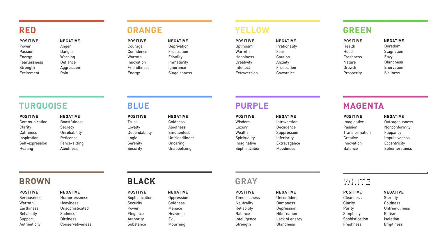
Click on the image above to view and download the Color Psychology Chart (pdf).
The Color Psychology Chart gives you a quick glimpse at the meaning behind 12 of the world’s most popular colors.
While context and culture matter, research has shown that these are the emotions most often associated with each color.
So, whether you’re choosing colors for branding, colors for marketing, or colors for advertising, this quick reference guide will help you pick the shade that best communicates the meaning behind your message.
The Psychology of 12 Popular Colors
There’s no shortage of benefits to understanding the psychology of colors when it comes to branding and marketing. Look no further than the marketing colors of the world’s top brands to see how powerful color psychology can be.
So, what are the psychological associations of the most commonly used colors in branding and marketing?
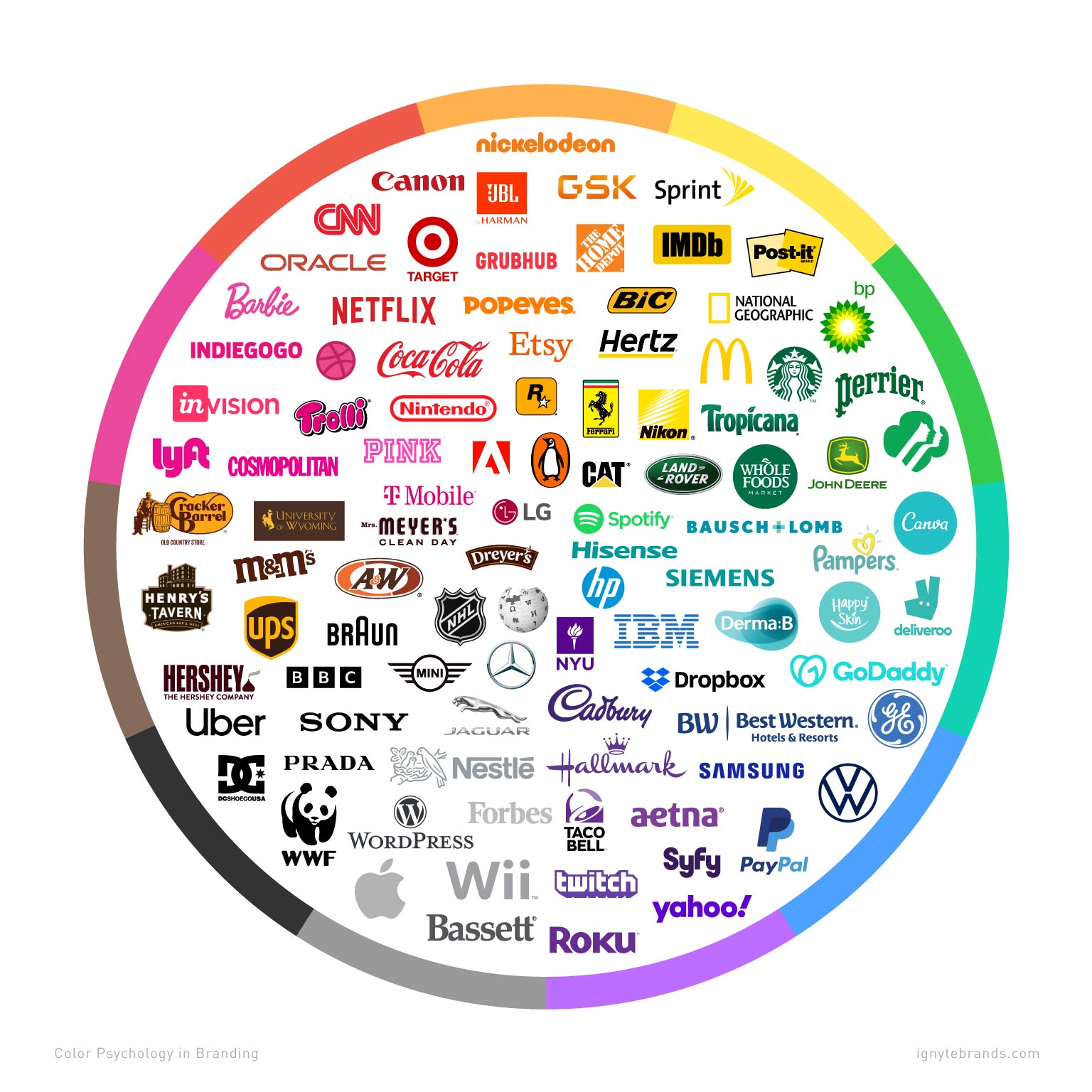
What follows is a list of the 12 most commonly used branding and marketing colors, along with the color psychology guidelines for each.
Remember, none of these emotional responses are empirically fixed to any given color. When it comes to the psychology of colors in branding, context and culture matter.
Because one color can represent two wildly divergent feelings, the specific way in which a brand utilizes a marketing color can literally mean the difference between sickness and health (green).
The good news is, with a solid understanding of your brand positioning and brand personality, choosing the right color for your brand can be a rational, informed decision.
The Color Psychology of Red
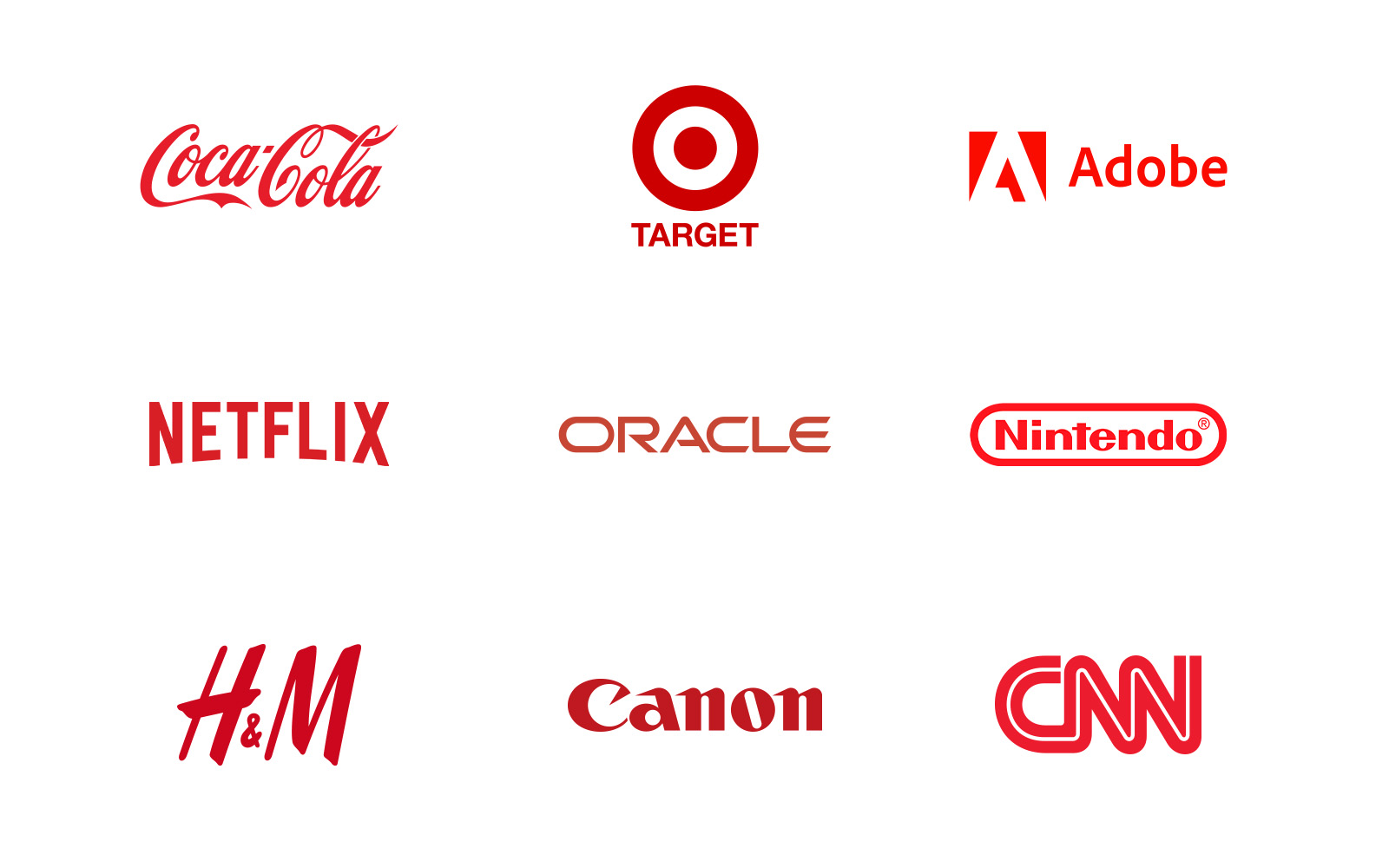
Red is the most emotionally charged color—and its effects are none too subtle. For this reason, it’s important to be careful when using red for branding purposes. There’s a long list of world-class brands that have used red to great effect in their marketing colors. But to do it well takes tact and restraint.
Red has been shown to reduce analytical thinking, after all—it speeds up and intensifies our reactions. This makes red one of the best colors for advertising. There’s a reason why clearance sale prices are put on red tags. Because it has the longest wavelength of all the colors, red actually appears to be nearer than it actually is.
Studies have also shown that athletes up against opponents wearing red are more likely to lose, and that students tend to perform worse on tests if exposed to red beforehand. Red, of course, is the color of stop signs, grammatical mistakes, and negative finances.
Red tends to increase the appetite and is used in a range of colorful terms centered on excitement: red-hot, red-handed, paint the town red, seeing red. It is the color of passion and romance, of energy and excitement.
Other emotions linked to red include:
Positive Associations
- Power
- Passion
- Energy
- Fearlessness
- Strength
- Excitement
Negative Associations
- Anger
- Danger
- Warning
- Defiance
- Aggression
- Pain
The Color Psychology of Orange

At the crossroads of red and yellow is orange. Orange is stimulatory, conjuring feelings of excitement, enthusiasm, and warmth. It is a fun, energetic color, which is why you’ll find it in the branding of many sports teams.
Similar to red and yellow, orange is often used to draw attention—from traffic cones to website buttons. Research shows that consumers tend to associate orange with value, a fact that brands like Home Depot have capitalized on.
On the physical end of the spectrum, orange evokes comfort like food, warmth, and shelter. It is the color of sunset, citrus, and pumpkins, forever linked to fall and Halloween for American customers. This is especially the case when it is paired with black, which lends it a tone of cartoonish dread and frivolity.
Orange’s color psychology associations include:
Positive Associations
- Courage
- Confidence
- Warmth
- Innovation
- Friendliness
- Energy
Negative Associations
- Deprivation
- Frustration
- Frivolity
- Immaturity
- Ignorance
- Sluggishness
The Color Psychology of Yellow

Yellow may have the smallest fan club of all the colors in marketing, but those who do like it are passionate about their preference. Yellow is widely considered a cheerful hue, but too much yellow can also trigger feelings of anger, frustration, fear, and anxiety.
There’s a reason you won’t find yellow on an a cruise ship: it can make many people feel nauseous. This is because yellow is the most difficult color to process visually. It’s enough to make babies cry in some studies.
Yellow has been shown to increase metabolism, and can lift self-esteem when used strategically. Because it has a relatively long wavelength, it is the most visible color. This is what makes yellow so stimulating and attention-grabbing. Traffic signs, advertisements, post-it notes, and warning labels all leverage yellow’s brand color meanings for this reason.
Other brand color meanings linked to yellow include:
Positive Associations
- Optimism
- Warmth
- Happiness
- Creativity
- Intellect
- Extraversion
Negative Associations
- Irrationality
- Fear
- Caution
- Anxiety
- Frustration
- Cowardice
The Color Psychology of Green

The color green is the easiest on our eyes because it requires no adjustment when it hits the retina. Green is therefore calming, restful, and pleasing. Ever wonder why performers waiting to go on stage or television wait in “green rooms” to calm their nerves?
Green can actually improve vision, and is used in night vision because our eyes can discern the most shades of it. Sitting comfortably in the middle of the spectrum, green is the color of balance. Its brand color meanings include nature, fertility, and even sexuality. We’ve all heard the myth about green M&M’S.
A green world is a safe world, one that is lush, full of water, and life-giving. Like all colors, though, green has its negative side. It is at once the symbol of health and sickness, luck, and jealousy.
The list of green’s color psychology associations includes:
Positive Associations
- Health
- Hope
- Freshness
- Nature
- Growth
- Prosperity
Negative Associations
- Boredom
- Stagnation
- Envy
- Blandness
- Enervation
- Sickness
The Color Psychology of Turquoise

Turquoise is a transformational color, sitting squarely between the contemplative security of blue and the organic ease of green.
Turquoise evokes clarity of thought and communication. It is one of the most inspiring colors in marketing, associated with recharging the spirit, replenishing energy levels, and provoking positive thought.
Turquoise calls to mind creativity and self-expression. This is why you’ll often see it in communication-centric brands in industries like education, media, and technology. It’s also an ideal marketing color for cleaning products as it evokes cleanliness and purity without being too sterile.
On the negative side, because it’s a color of transformation, turquoise can suggest indecision and a lack of grounded deliberation if used in the wrong context.
Other brand color meanings associated with turquoise are:
Positive Associations
- Communication
- Clarity
- Calmness
- Inspiration
- Self-expression
- Healing
Negative Associations
- Boastfulness
- Secrecy
- Unreliability
- Reticence
- Fence-sitting
- Aloofness
The Color Psychology of Blue

Where red is the color of the body, blue evokes the mind. Serene and calming, blue is the color of clarity and communication. It’s the most common “favorite color” cited by the world’s population (especially when it comes to men).
Blue, of course, everywhere in our daily lives. It’s the color of the clear sky and nearly every body of water we encounter. Its popularity and environmental omnipresence make blue non-threatening, conservative, and traditional. It’s seen as the safest bet by brands—in fact, more than 33% of brands use blue as their primary color.
Blue evokes trustworthiness and security, which is why it is so common across the financial industry, from retail banking to private equity brands. Studies have even shown that people are more productive when working in blue rooms.
Of course, blue is also the color of sadness and coldness. You won’t find many food brands using blue. It’s among the least appetizing of colors as it’s an indicator of spoilage and poison. Weight loss plans suggest you eat food off a blue plate as you’re liable to eat less of it.
Blue’s emotional attributions include:
Positive Associations
- Trust
- Loyalty
- Dependability
- Logic
- Serenity
- Security
Negative Associations
- Coldness
- Aloofness
- Emotionless
- Unfriendliness
- Uncaring
- Unappetizing
The Color Psychology of Purple

At the intersection of red and blue, purple has an intersting balance of masculine and feminine traits when it comes to the psychology of colors in marketing. It’s at once warm and cool, yet neither.
This melding of blue’s calmness and red’s stimulation can be unnerving unless the dominance of one or the other is clear. Blueish purple, then, is read as cool, while reddish purple is seen as warm.
Purple is the color of royalty and bravery, and connotes wealth, luxury, and sophistication. It’s among the rarest colors in nature and as such can come across as either special or artificial.
Purple sits in the shortest wavelength and is the last to be visible. For this reason, it’s often associated with time, space, and the cosmos. Purple is imbued with spirituality, contemplation, and mediation, suggesting creativity and imagination.
Purple’s color psychology associations include the following:
Positive Associations
- Wisdom
- Luxury
- Wealth
- Spirituality
- Imaginative
- Sophistication
Negative Associations
- Introversion
- Decadence
- Suppression
- Inferiority
- Extravagance
- Moodiness
The Color Psychology of Magenta

Not quite red and not quite purple, magenta is very much its own hue with a slew of distinct and psychological implications when it comes to marketing color psychology. Magenta is a color of emotional balance and physical harmony. It’s sophisticated yet pragmatic, evocative of logic and perspicacity.
Magenta evokes compassion, support, and kindness, and is associated with feelings of self-respect and contentment. It’s a color of transformation, suggesting the sloughing off of old ideas and the embrace of new ones.
Magenta retains a certain level of boldness from red and can therefore appear either outrageous and shocking or innovative and imaginative, depending on the context. It is well-suited to creative and/or nonconformist endeavors.
The psychological associations of magenta include the following:
Positive Associations
- Imaginative
- Passion
- Transformation
- Creative
- Innovation
- Balance
Negative Associations
- Outrageousness
- Nonconformity
- Flippancy
- Impulsiveness
- Eccentricity
- Ephemeralness
The Color Psychology of Brown

Brown is made up of constituent hues red and yellow, with a large percentage of black. For this reason, it’s imbued with much of the same seriousness as black, but with a warmer, softer edge.
Brown is sturdy and reliable, the color of earth and abundant in nature. It evokes the dependability and authenticity of wood and is more often among the preferred colors of men than women.
Brown has robust overtones but can also be sad and wistful. At heart a practical and utilitarian color, brown can be sophisticated if used correctly. Just think of classic leather shoes or a stylish leather bag.
Few colors in marketing are so immediately associated with a single brand than brown. To its credit, UPS has milked brown for all its worth, even crafting an entire marketing campaign and attendant tagline around it (“What can brown do for you?”). It would be hard to imagine a brand entering the shipping space and trying to pull off brown as its signature color. Such is the power of color psychology in branding.
Brown’s marketing color psychology attributes include:
Positive Associations
- Seriousness
- Warmth
- Earthiness
- Reliability
- Support
- Authenticity
Negative Associations
- Humorlessness
- Heaviness
- Lack of sophistication
- Sadness
- Dirtiness
- Conservativeness
The Color Psychology of Black

Black is the total absorption of all color. This fact alone has profound implications when it comes to the psychology of colors in marketing. Black is a symbol of power. It is a barrier color: it absorbs energy and attention.
There is no nuance to black, at least not conceptually. With its diametric partner in crime, white, black stands for sophistication, weight, and seriousness. Black is timeless and effortlessly stylish. Think the little black dress or a certain iconic black turtleneck.
As essentially the absence of light, black can have ominous overtones. While it’s the color of sophistication, it is also that of mourning. Worn by both priests and villains, it can imply submission (to God) or nefariousness and evil.
Black’s color psychology associations of include:
Positive Associations
- Sophistication
- Security
- Power
- Elegance
- Authority
- Substance
Negative Associations
- Oppression
- Coldness
- Menace
- Heaviness
- Evil
- Mourning
The Color Psychology of Gray

Pure gray is the one color that’s been shown to have no dominant association when it comes to the psychology of colors in marketing. But that doesn’t mean it’s not powerfully suggestive. Gray is modern and sophisticated, a hue that has worked well for technology and luxury brands. Its inherent subtlety can be both a strength and a weakness.
Skillful use of gray evokes power and sophistication; it is a crisp slate on which bold concepts thrive. Gray is the color of ominous but powerful weather—a cloak over the existence of color rather than the absence of it.
Gray has a profound effect on the colors around it, working both to balance tones and establish negative space in lieu of white.
The brand color meanings of gray include:
Positive Associations
- Timelessness
- Neutrality
- Reliability
- Balance
- Intelligence
- Strength
Negative Associations
- Lack of confidence
- Dampness
- Depression
- Hibernation
- Lack of energy
- Blandness
The Color Psychology of White

Where black is the absorption of all light and color, white is the reflection and absence of it. For this reason, white has long been associated with purity when it comes to marketing color psychology.
In healthcare branding, white implies cleanliness and sterility. Outside of the hospital, it is a sign innocence and minimalism.
White’s association with marriage and wedding dresses is deeply entrenched. But it’s also modern, leveraged by brands like Apple to denote a chic, sleek style. It is the simplest of all the colors, imbuing a heightened perception of space.
White is the color of blank slates, symbolizing freshness and new beginnings. The sterility that is positive for white in the healthcare sphere can count against it elsewhere. Used haphazardly, white can bring to mind coldness, emptiness, and isolation.
The psychology behind the color of white includes:
Positive Associations
- Cleanness
- Clarity
- Purity
- Simplicity
- Sophistication
- Freshness
Negative Associations
- Sterility
- Coldness
- Unfriendliness
- Elitism
- Isolation
- Emptiness
5 Tips for Picking Your Brand Colors

Understanding color associations is helpful. Choosing a palette for a particular business means putting those associations in context.
Here are five principles we use to move the discussion beyond personal preference.
1. Start With Your Brand Personality
Before reviewing colors, agree on how your brand should feel. Is it energetic or measured? Approachable or exclusive? Traditional or unconventional?
Those decisions give your team a shared basis for evaluating options. Instead of asking, “Do we like this color?” ask, “Does this express the personality we want customers to recognize?”
People perceive colors differently, so agreement on a favorite shade is a weak foundation for a brand decision. Your positioning and personality provide a more useful starting point.
The Ultimate Guide to Rebranding
Everything you need to know about rebranding your business—and avoiding costly mistakes.
GET IT NOW2. Look for Opportunities to Stand Apart
Review competitors’ colors together before choosing your own. A palette can feel appropriate for your category but lack competitive differentiation.
We generally look for opportunities to stand apart by doing a brand audit, while considering the expectations and associations that matter to the audience. The goal is a distinctive choice that still feels right for the brand.
For Switch, a healthcare staffing platform, we wanted an alternative to the familiar blues and greens in the competitive landscape. Orange brought energy and warmth, while a deep Blue grounded the palette.
Together, the colors supported a brand personality defined as friendly, dependable, authentic, and innovative. The decision came from the positioning and competitive context, rather than a rule that healthcare brands should use a particular color.
See it in practice: Explore the Switch case study to see how the palette works across the identity, marketing materials, and website.
3. Give Each Color a Clear Role
For most brands, we recommend starting with one primary signature color, supported by a restrained selection of neutrals such as black, gray, or white.
Additional colors can be useful, but each should have a purpose. A secondary color might provide contrast, distinguish product lines, or support charts and information design.
You don’t need a spectrum of colors. A focused palette gives your signature color more opportunity to become associated with your brand.
4. Test Colors Where They’ll Be Used
A palette needs to work beyond the presentation in which it was approved. Try it on website pages, mobile screens, presentations, and any relevant printed materials.
Check text legibility and contrast. Make sure important information remains understandable without relying on color alone.
Even brands that operate primarily online may need business cards, event graphics, signage, or printed sales materials. Review physical proofs where appropriate rather than assuming a vivid screen color will reproduce the same way in print.
5. Protect Consistency With Clear Guidelines
Choosing the palette is only the beginning. Its value depends on how consistently your team uses it.
Document color specifications, approved combinations, and the role of each color in your brand guidelines. Give someone responsibility for maintaining those standards as new people and partners work with the brand.
Expand the palette when there’s a clear need, not simply because someone wants a new option. Any addition should work with the existing system and have a defined purpose.
The Takeaway
Color psychology can help you understand the associations a palette may bring to your brand. It can’t make the decision for you.
Start with your positioning and personality, consider your audience, and look for opportunities to distinguish yourself from competitors. Then test the palette in real applications and give your team clear guidance for using it.
The aim is a palette that feels right for your brand—and becomes more recognizable through consistent use.
The Ultimate Guide to Rebranding
Everything you need to know about rebranding your business—and avoiding costly mistakes.
GET IT NOWBrian Lischer
A prolific blogger, speaker, and columnist, Brian has two decades of experience in design and branding. He’s written for publications including Forbes, Entrepreneur, Inc. Magazine, Fast Company, HuffPost, and Brand Quarterly.


